library(HH)
library(tidyverse)
data(starwars)
data(msleep)
data(diamonds)
data(mpg)4 Statistics
This chapter provides a collection of resources for completing various statistical summaries, analyses, and visualizations common to many research projects. Given the inherent complexity of data analysis work, it is likely that your project will require some unique solutions to your particular problems. However, this chapter contains tips for how to accomplish common tasks using R.
The examples below use some of the datasets that are included in R and its libraries. To run the example code in this chapter, you will need to first run the following commands in your R Console:
4.1 Common Data Tasks
4.1.1 Sample Size
Want to know how many participants are in your dataset? If your dataset was the characters from the Star Wars movies, you could find it like this:
n_distinct(starwars)[1] 874.1.2 Counting things
Often, we want to count how many responses of each type are found in our data (e.g., counting how many “yes” vs. “no” responses we received). The count() function can be quite helpful for this. Using the built-in starwars dataset, we can count how many characters of each eye color there are:
starwars |> count(eye_color)# A tibble: 15 × 2
eye_color n
<chr> <int>
1 black 10
2 blue 19
3 blue-gray 1
4 brown 21
5 dark 1
6 gold 1
7 green, yellow 1
8 hazel 3
9 orange 8
10 pink 1
11 red 5
12 red, blue 1
13 unknown 3
14 white 1
15 yellow 11You can display those counts in sorted order as well:
starwars |> count(eye_color, sort = TRUE)# A tibble: 15 × 2
eye_color n
<chr> <int>
1 brown 21
2 blue 19
3 yellow 11
4 black 10
5 orange 8
6 red 5
7 hazel 3
8 unknown 3
9 blue-gray 1
10 dark 1
11 gold 1
12 green, yellow 1
13 pink 1
14 red, blue 1
15 white 1If you want to cross-tabulate two (or more) variables, we can do that as well. Here we count eye_color by sex:
starwars |> count(eye_color, sex)# A tibble: 27 × 3
eye_color sex n
<chr> <chr> <int>
1 black female 2
2 black male 7
3 black none 1
4 blue female 6
5 blue male 12
6 blue <NA> 1
7 blue-gray male 1
8 brown female 4
9 brown male 15
10 brown <NA> 2
# ℹ 17 more rows4.1.3 Missing Data
In research it is common to have missing data. This can happen, for example, when a participant chooses not to answer a particular question on a survey. In R, these missing values are shown as NA, and their presence complicates things. For example, imagine you asked survey respondents to share their age. You collected their responses, loaded the data into R, and when you inspect the ages you find the following five responses:
32, 27, 26, NA, 48It seems that one individual didn’t provide their age. What happens if you try to calculate the mean age of the sample?
age = c(32, 27, 26, NA, 48)

mean(age)
[1] NAThe average age is NA. It seems the presence of that single missing age ruins the entire calculation. To calculate the mean, we’re going to have to deal with that single missing value.
There are (at least) three options:
- Consider removing the participant entirely from the dataset. See the section on removing outliers for determining if this is a good idea.
- Some functions in R support the
na.rm = TRUEoption. - Other analyses require the use of the
drop_na()command.
For options #2 and #3, you will find several examples of each throughout this chapter. Try searching for either na.rm or drop_na to find these examples.
4.1.4 Splitting Data into Groups
Often it is necessary to split our data into different groups while completing some analysis. For example, you might be interested in the average resting heart rate of a sample of individuals, but you would like to compare the runners in your group to the non-runners. In this common scenario, you want to find the mean of the dependent variable (resting heart rate) after splitting your sample by some independent variable (runner/non-runner). This is easy to do in R. As an example, we’ll find the mean body mass for Star Wars characters after splitting the data into groups based on the sex of the character:
starwars |>
    drop_na(sex, mass) |>
    group_by(sex) |>
    summarize(mean = mean(mass))
# A tibble: 4 × 2
sex mean
<chr> <dbl>
1 female 54.7
2 hermaphroditic 1358
3 male 80.2
4 none 69.8To calculate the standard deviation for each group we make a small change:
starwars |>
    drop_na(sex, mass) |>
    group_by(sex) |>
    summarize(sd = sd(mass))
# A tibble: 4 × 2
sex sd
<chr> <dbl>
1 female 8.59
2 hermaphroditic NA
3 male 28.5
4 none 51.0
Tip
The reason we are getting the value NA for hermaphroditic characters is because there is only one such character in the data, and you need more than one datum to calculate the standard deviation.
4.1.5 Dealing with “flipped polarity” Likert questions
Likert-style response options are ordinal, so moving across the scale either increases or decreases the strength of the response. Consider the following common response set:
- Very infrequently
- Infrequently
- Neither frequently or infrequently
- Frequently
- Very frequently
The higher the response option a respondent chooses, the more frequently they engage in the behavior. This means that the way the question is asked determines how they should respond. Consider the following two hypothetical survey questions:
- When hungry I tend to eat candy as a snack.
- I eat savory foods for breakfast.
Notice that answering “5 - Very frequently” for the first survey question means that the respondent frequently chooses a sugary option. However, for the second survey question, responding with a “5” means that they do NOT frequently choose a sugary option. The polarity of these two questions are different. If you wanted to combine these two questions into a single composite score, you would need to reverse one of them to ensure that they shared the same polarity. Since we’re interested in behaviors associated with eating sugary foods, let’s say we want to flip the second question. Here’s the algorithm for doing this:
- Count how many Likert response options there are: in this example we have 5 possibilities.
- Add 1 to this number: this gives us 6 in this situation.
- Subtract that number from each participant response.
- Take the absolute value of those differences
Here’s an example. Say we have the following responses (which have been numbered in order to make this easier to read):
responses = c(1, 2, 3, 4, 5)Say these responses came from the above Likert scale. So we need to subtract 6 from each of them. Since things are vectorized in R, this can be done all at once:
responses - 6[1] -5 -4 -3 -2 -1Notice that this gives us negative numbers. This is why we need to then take the absolute value. Here’s the final (and only) command you need to flip the polarity:
responses = abs(responses - 6)Notice how the scores look now that they’ve been “flipped”:
responses[1] 5 4 3 2 1Of course, for your actual Qualtrics data, this step will be applied to one of your dataset’s columns. Here’s some pseudo-code to use. You’ll just have to change Q1 to whatever your actual question column name is, as well as changing “6” to whatever number is appropriate:
d = d |> mutate(Q1 = abs(Q1 - 6))4.1.6 Composite scores: turning multiple Likert responses into a single score
Important
If you have any flipped polarity questions that will be included in a composite score, you must first flip them before creating the composite score.
The project manual has a section on creating composite scores using multiple Likert question. Please read that text carefully before attempting what is described in this section.
In short, Likert data are ordinal data, which means you cannot do things like asking whether “social media users are two times more likely to agree with a statement.” A common workaround, often used with things like survey-based anxiety tests is to ask multiple Likert-based questions, and then combine them into a single score by adding up the responses from each individual question. Please read the previously mentioned project manual section for a full description.
Accomplishing this in R is trivial. However, you must first have your data in numerical format. For example, Likert questions often have numerical values and text anchors, such as:
- Very infrequently
- Infrequently
- Neither frequently or infrequently
- Frequently
- Very frequently
For our analyses, we have downloaded our data in two formats—text and numeric. The text version of survey responses, stored in the variable d, contains responses such as “Infrequently” and “Frequently.” The numeric version of survey responses, stored in the variable dn, contains responses such as “2” and “4,” respectively. You will need to use the numeric data dn to generate composite scores.
The following code block shows how to take three hypothetical Likert questions and turn them into a single composite score.
Imagine that you have the following three data columns, corresponding to some corresponding original question text:
- offended_fb: How often have you been offended by something posted on Facebook
- offended_twit: How often have you been offended by something posted on Twitter
- offended_inst: How often have you been offended by something posted on Instagram
Since these all measure offense we might add them together to create a single composite score. Since the possible values (1-5) imply increasing frequency of offense, a higher composite score would suggest that the person is more offended (or more easily offended). Here’s how we would create a new data column called offended that contains the composite scores:
dn = dn |> mutate(offended = offended_fb + offended_twit + offended_inst)Now we can use the newly created “offended” column, which has the composite score for each participant, in any other calculation, figure, etc.!
Note
If, after calculating a composite score, a participant has a composite score of NA, this means that the offended participant did not answer one or more questions.
4.2 Creating figures
When plotting data R provides simple tools for the usual kinds of figures one might want to generate. Most of these simple commands provide sane, albeit boring, defaults for things like axis ranges, text labels, etc. But most plotting commands also accept extra options that allow you to customize your figures to look much better.
4.2.1 Plot colors
Many plot functions accept the col = "color" option, where you replace color with a recognized color name. You can see the available color options in R by running the command colors(). Alternatively, you can view available colors here.
4.2.2 Scatter plots
For these examples, we will be using the mammalian sleep data provided with R:
data(msleep)
msleep
# A tibble: 83 × 11
name genus vore order conservation sleep_total sleep_rem sleep_cycle awake
<chr> <chr> <chr> <chr> <chr> <dbl> <dbl> <dbl> <dbl>
1 Cheet… Acin… carni Carn… lc 12.1 NA NA 11.9
2 Owl m… Aotus omni Prim… <NA> 17 1.8 NA 7
3 Mount… Aplo… herbi Rode… nt 14.4 2.4 NA 9.6
4 Great… Blar… omni Sori… lc 14.9 2.3 0.133 9.1
5 Cow Bos herbi Arti… domesticated 4 0.7 0.667 20
6 Three… Brad… herbi Pilo… <NA> 14.4 2.2 0.767 9.6
7 North… Call… carni Carn… vu 8.7 1.4 0.383 15.3
8 Vespe… Calo… <NA> Rode… <NA> 7 NA NA 17
9 Dog Canis carni Carn… domesticated 10.1 2.9 0.333 13.9
10 Roe d… Capr… herbi Arti… lc 3 NA NA 21
# ℹ 73 more rows
# ℹ 2 more variables: brainwt <dbl>, bodywt <dbl>Scatter plots can be used when comparing two continuous variables. These graphs provide a quick means for visually inspecting your data for a relationship (that you might further test with a correlation).
Say we want to see if there’s a relationship between how much time an animal sleeps and time spent in the REM sleep cycle:
msleep |>
  ggplot(aes(sleep_total, sleep_rem)) +
  geom_point()
Warning: Removed 22 rows containing missing values or values outside the scale range
(`geom_point()`).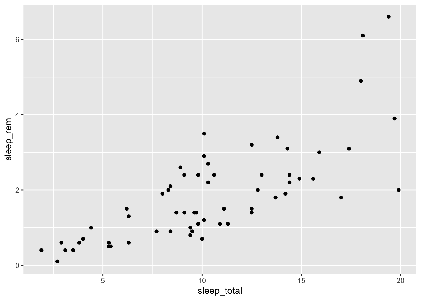
We can dress this up with better labels:
msleep |>
  ggplot(aes(sleep_total, sleep_rem)) +
  geom_point() +
  labs(x = "Total Sleep (hours)",
       y = "REM Sleep (hours)",
       title = "Mammalian Sleep Patterns")
Warning: Removed 22 rows containing missing values or values outside the scale range
(`geom_point()`).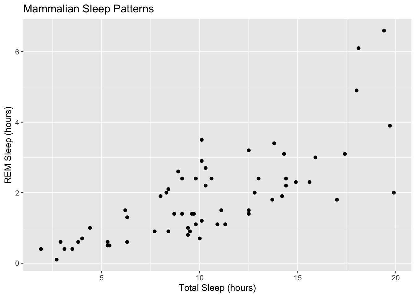
We can make the points larger as well:
msleep |>
  ggplot(aes(sleep_total, sleep_rem)) +
  geom_point(size = 4) +
  labs(x = "Total Sleep (hours)",
       y = "REM Sleep (hours)",
       title = "Mammalian Sleep Patterns")
Warning: Removed 22 rows containing missing values or values outside the scale range
(`geom_point()`).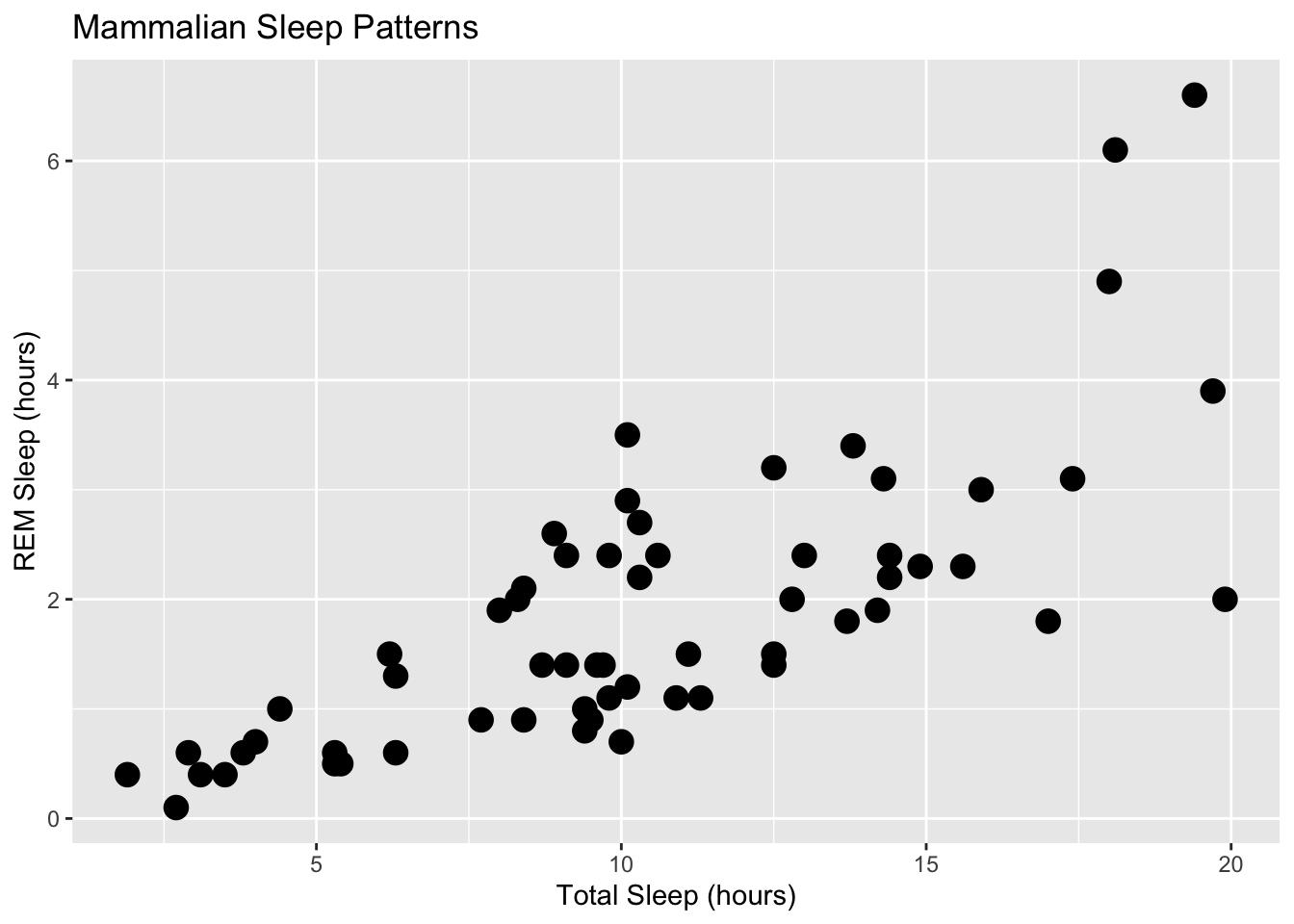
A third variable can even be included in a scatter plot by tying the third variable to another feature, such as the color of the points. For example, we could color each point based what type of eater (carnivore, herbivore, etc.) the animal is:
msleep |>
  ggplot(aes(sleep_total, sleep_rem, color = vore)) +
  geom_point(size = 4) +
  labs(x = "Total Sleep (hours)",
       y = "REM Sleep (hours)",
       title = "Mammalian Sleep Patterns")
Warning: Removed 22 rows containing missing values or values outside the scale range
(`geom_point()`).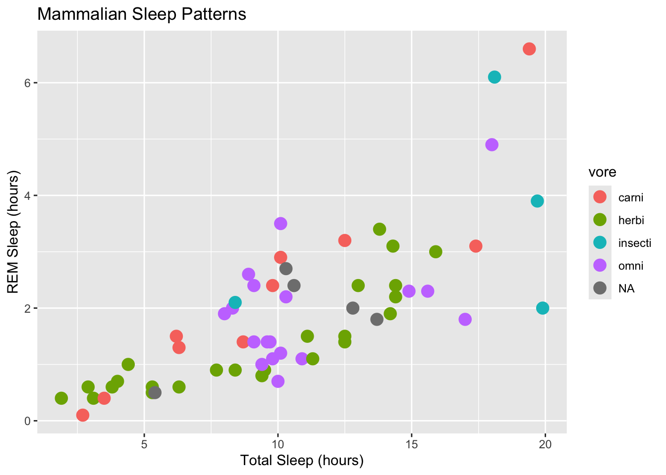
4.2.3 Bar plots
Bar plots are useful for visualizing things like
- Numerical summaries involving single numbers, such as plotting the means of various experimental conditions.
- Counts of nominal data (e.g., how many “yes” and “no” responses).
Here’s a simple bar plot of the number of animals in each dietary category in the msleep dataset:
msleep |>
  ggplot(aes(vore)) +
  geom_bar() +
  labs(x = "Dietary pattern",
       y = "# of mammals",
  title = "Mammalian Dietary Preferences")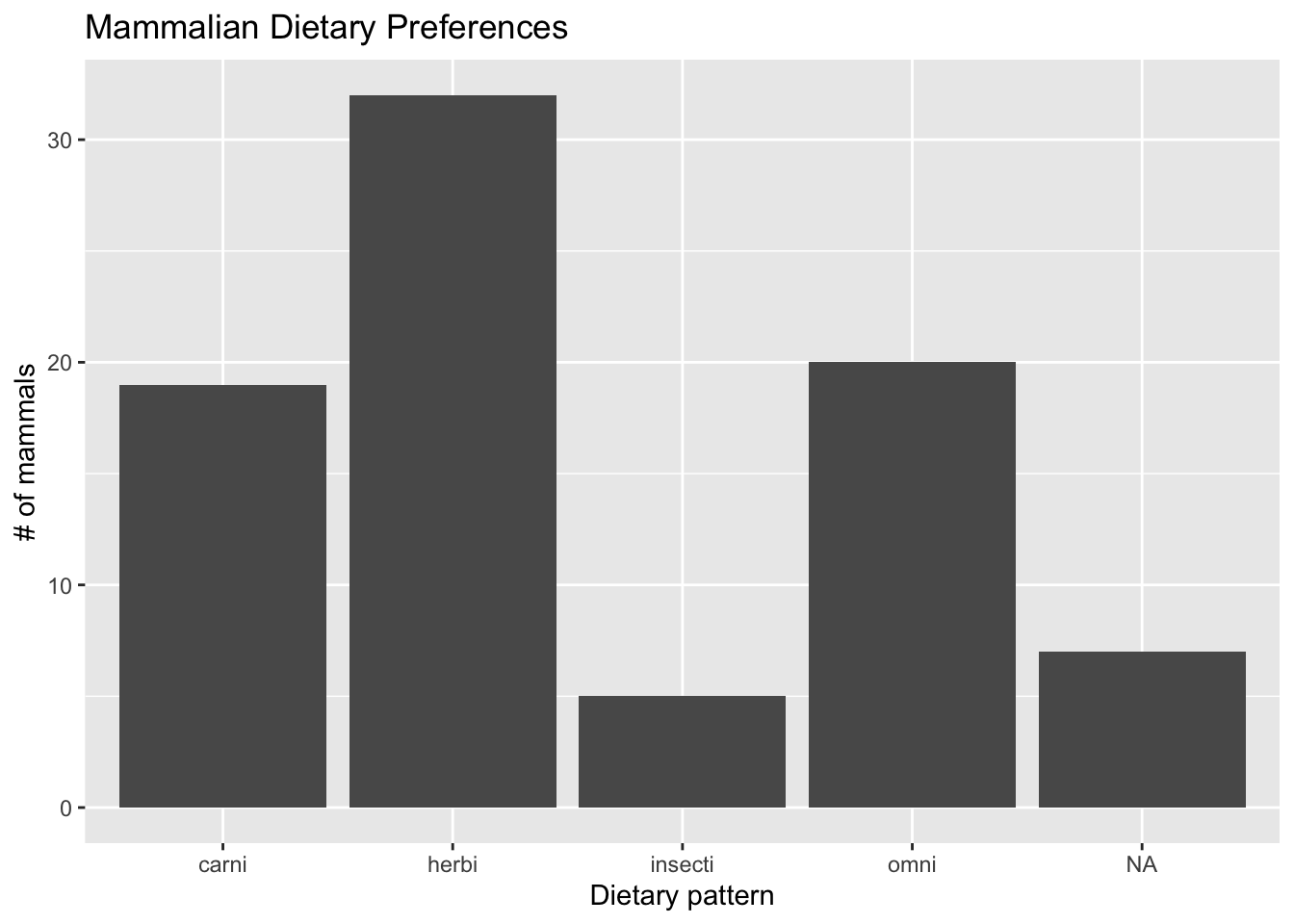
Sometimes you want horizontal bars. Here’s how to change the plot’s behavior.
msleep |>
  ggplot(aes(vore)) +
  geom_bar() +
  coord_flip() +
  labs(x = "Dietary pattern",
       y = "# of mammals",
  title = "Mammalian Dietary Preferences")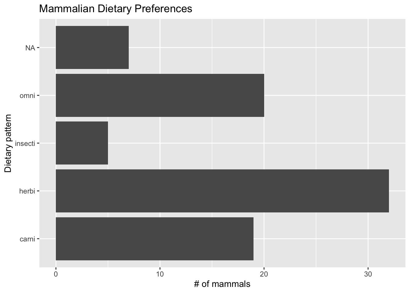
Often it’s preferable to convert counts into percentages. In this example I count the number of animals, and then divide by the total number to convert to percentages:
msleep |>
  count(vore) |>
  mutate(perc = n / nrow(msleep) * 100) |>
  ggplot(aes(vore, perc)) +
  geom_col() +
  labs(x = "Dietary pattern",
       y = "Percentage of mammals",
  title = "Mammalian Dietary Preferences")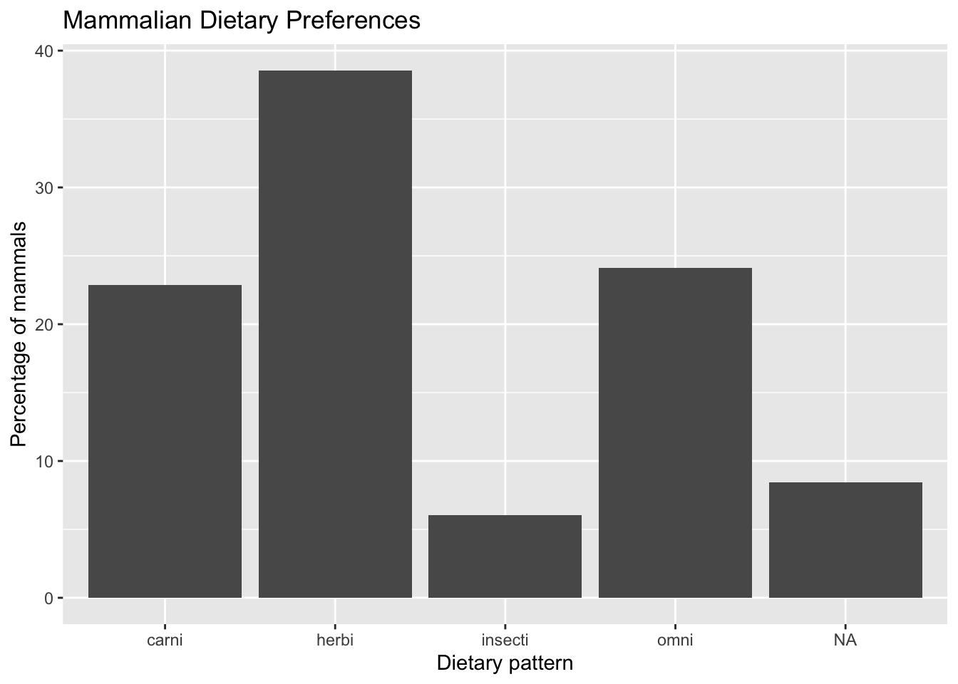
4.2.4 Histograms
For these examples, we will be using the round cut diamonds data provided with R:
data(diamonds)
diamonds
# A tibble: 53,940 × 10
carat cut color clarity depth table price x y z
<dbl> <ord> <ord> <ord> <dbl> <dbl> <int> <dbl> <dbl> <dbl>
1 0.23 Ideal E SI2 61.5 55 326 3.95 3.98 2.43
2 0.21 Premium E SI1 59.8 61 326 3.89 3.84 2.31
3 0.23 Good E VS1 56.9 65 327 4.05 4.07 2.31
4 0.29 Premium I VS2 62.4 58 334 4.2 4.23 2.63
5 0.31 Good J SI2 63.3 58 335 4.34 4.35 2.75
6 0.24 Very Good J VVS2 62.8 57 336 3.94 3.96 2.48
7 0.24 Very Good I VVS1 62.3 57 336 3.95 3.98 2.47
8 0.26 Very Good H SI1 61.9 55 337 4.07 4.11 2.53
9 0.22 Fair E VS2 65.1 61 337 3.87 3.78 2.49
10 0.23 Very Good H VS1 59.4 61 338 4 4.05 2.39
# ℹ 53,930 more rowsHistograms are used to visualize frequency distributions (how often each value shows up in a dataset).
Here’s a histogram of the price of nearly 54,000 diamonds:
diamonds |>
  ggplot(aes(price)) +
  geom_histogram() +
  labs(title = "Round Cut Diamond Prices",
       x = "US Dollars")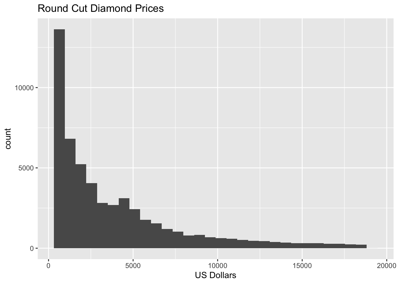
You can also specify the desired number of bins in your histogram by including a bins option:
diamonds |>
  ggplot(aes(price)) +
  geom_histogram(bins = 15) +
  labs(title = "Round Cut Diamond Prices",
       x = "US Dollars")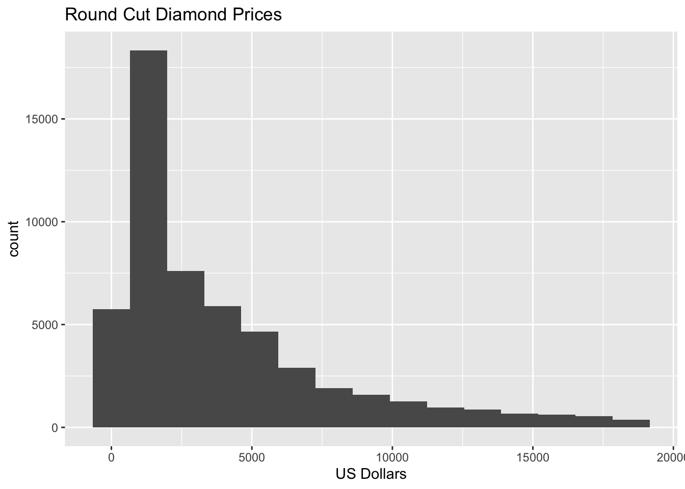
4.2.5 Diverging stacked bar charts
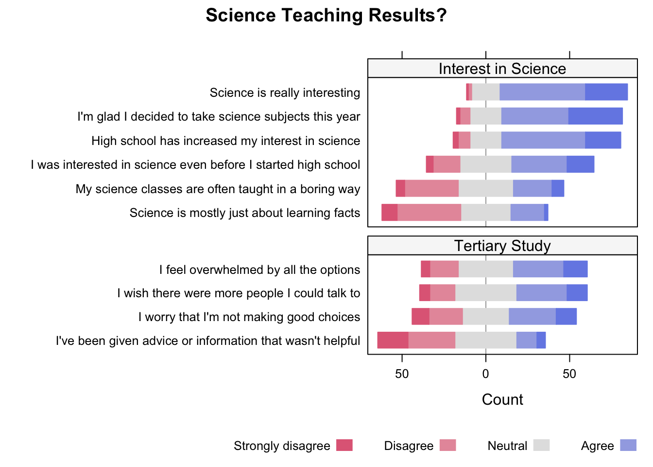
For Likert responses, the appropriate visualization is the diverging stacked bar chart.
Creating these figures in R takes considerable skill and knowledge about R itself. I won’t attempt to explain. Instead, use the recipes below, replacing scale labels, variable names, etc. to create similar figures:
# You must specify your Likert response scale IN ORDER
responses = c("Very Infrequently", "Infrequently",
              "Neither Frequently or Infrequently",
              "Frequently", "Very Frequently")

s = d |>
  select(facebook = use_fb,
         twitter = use_twit,
         instagram = use_inst) |>
  mutate(across(everything(), ~ factor(.x, levels = responses)))


results = s |>
  sapply(table) |>
  t() |>
  as.data.frame() |>
  rownames_to_column() |>
  rename(platform = rowname)

likert(platform ~ ., data = results,
       main = "News Consumption on Social Media Platforms",
       positive.order = TRUE,
       as.percent = TRUE,
       auto.key = list(columns = 2))
If done correctly, the following figures can be creating:

4.2.6 Exporting Figures
Once your figures are complete, you will need to export them from R for use in your final papers, posters, etc. Typically, this involves turning your figures into standalone files. In this class, there are two situations to be aware of:
- Papers: Exporting figures to use in your final papers is fairly simple.
- Posters: Exporting figures for use in posters requires more care.
4.2.6.1 Figures for use in Papers
When exporting figures for use in papers, the exported figure will typically look very similar to the one generated in your Quarto reports.
Imagine you have the following figure in your Quarto report that plots the height and mass of various Star Wars characters:
starwars |>
    filter(mass < 500) |>
    ggplot(aes(height, mass, col = sex)) +
    geom_point(size = 3)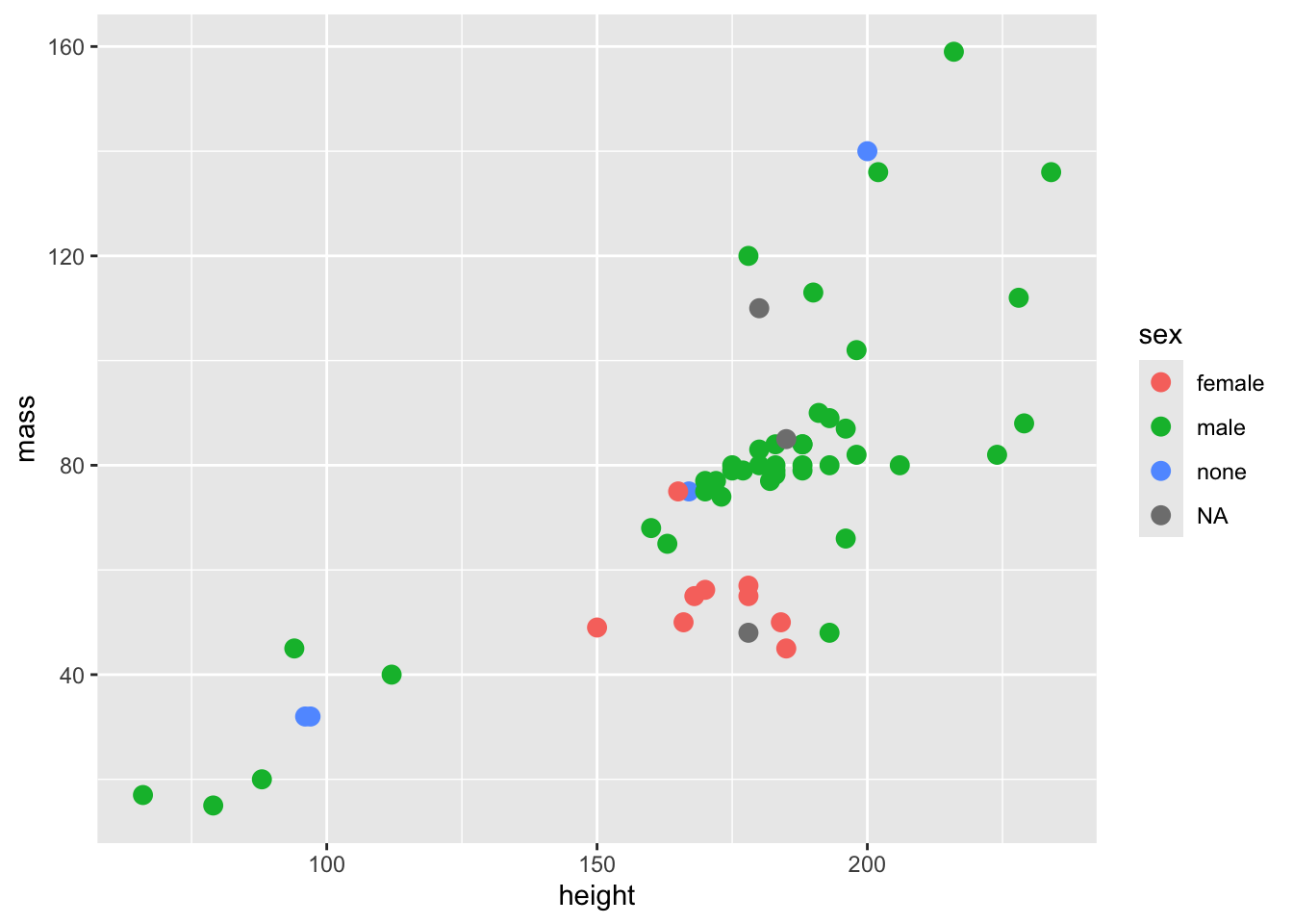
To create a standalone jpeg file for including in your final paper, you must manually do the following steps:
Open the “Command Palette”. On a Mac this can be done by pressing CMD+Shift+P, or by selecting “View –> Command Palette” under the file menus at the top of the screen. On Windows, the keyboard shortcut is Ctrl+Shift+P. In the Command Palette, search for and run the “Quarto: Run All Cells” command. This will load all of the necessary variables into your R console environment.
Next, in the console window, copy, paste, and then evaluate the code that generates the figure you want to export (copy it from the appropriate Quarto code chunk, then paste and run it in the R console window). In the example above, you would paste and run the following command. This will create and display the figure in the “Plots” window in the lower-right corner of Positron.
starwars |>
    filter(mass < 500) |>
    ggplot(aes(height, mass, col = sex)) +
geom_point(size = 3)- Now that the figure is visible in the Positron “Plots” window, you can save it to file by running a command like the following in the R console:
ggsave("my_figure.jpeg")This will create a jpeg file called “my_figure.jpeg” in the current working directory (your class folder). You can (and should) change “my_figure.jpeg” to an appropriately named file that indicates what the figure actually depicts (e.g., “tiktok_depression_barplot.jpeg”).
The newly created image file can be dropped into most word processors, such as Google Docs, MS Word, Apple Pages, etc.
4.2.6.2 Figures for use in Posters
As mentioned above, creating figures for posters requires a bit more care. The reason is that the process of exporting described above generates a rather small image. Additionally, jpeg images have the problem that they get blurry when you zoom/expand them. If you export a figure as described above and then drop it into your poster, it will appear tiny (because your poster is 4 feet by 3 feet).
Warning
You cannot simply stretch your figure in PowerPoint to make it bigger on your poster because zooming like this will make your image blurry, particularly when you print it to paper.
The solution is to export a larger version of your figure. Thankfully, this is easy in R. To export a larger version of your figure, change the jpeg() command above to something like the following:
ggsave("my_figure.jpeg", width = 10, height = 8, units = "in")This allows you to specify the image width and height in inches. Keep in mind that your poster will be 48x36 inches overall, so a 7x6 inch figure is probably about right (which is roughly the default of the ggsave() command).
However, when enlarging your figures it is possible that some aspects of the figure, such as the size of points, fonts, and axis tick marks, might remain small (if and how badly this occurs depends on the figure itself). This problem can be addressed with a little tinkering, such as changing the size of figure’s plotting components.
4.2.6.3 Example
Consider the following figure:
starwars |>
    filter(mass < 500) |>
    ggplot(aes(height, mass, col = sex)) +
    geom_point()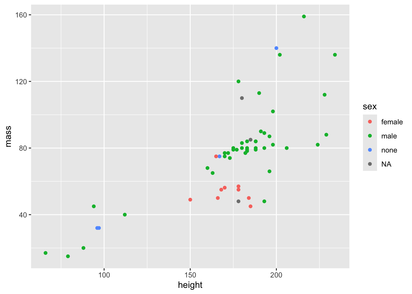
The points are fairly small in the figure, and might become vanishingly small when the figure is enlarged for a poster. We can increase their size so that they are more visible when printed on a physical paper. Here’s what tripling the point size does:
starwars |>
    filter(mass < 500) |>
    ggplot(aes(height, mass, col = sex)) +
    geom_point(size = 3)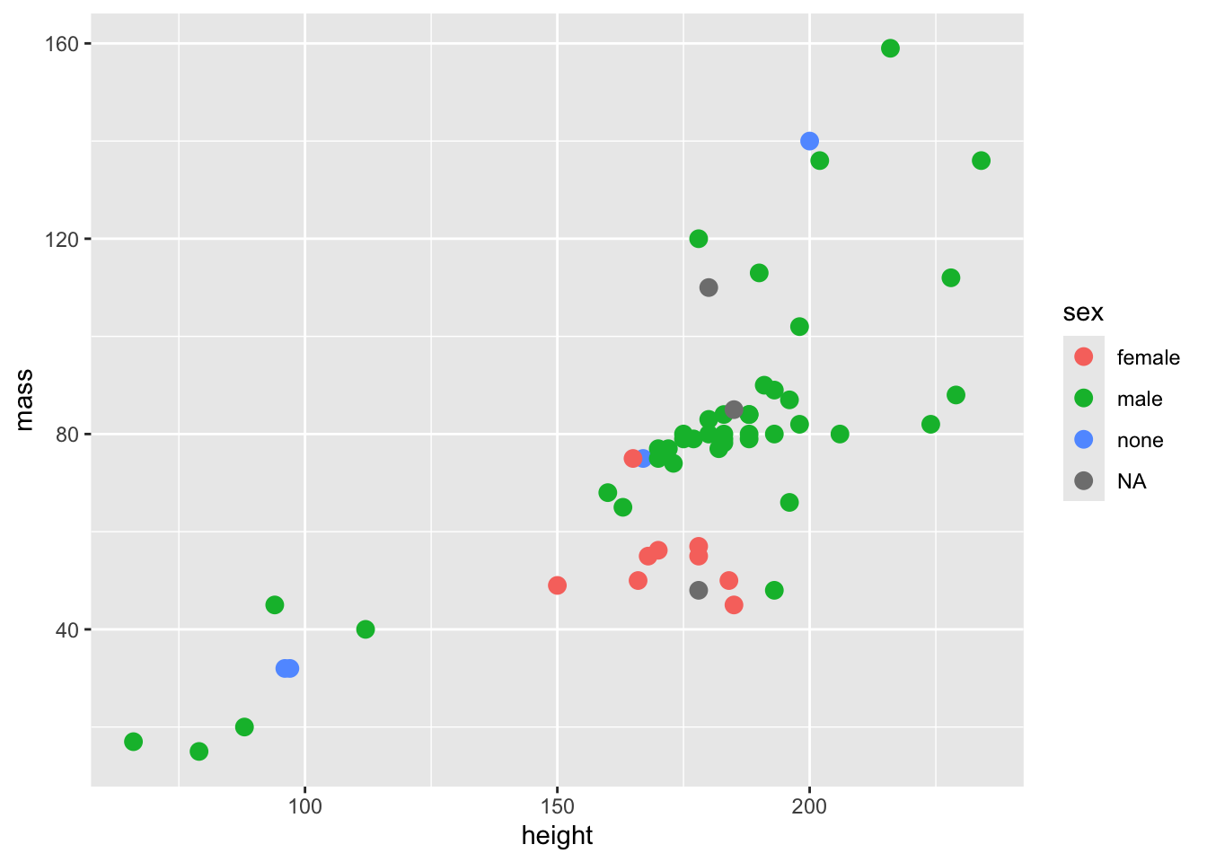
Note
Knowing what values to use for the various size commands requires trial and error. Change the values a little, export the figure, and then drop it into your poster. Once in the poster, you’ll be able to tell if the size of things is appropriate. If necessary, repeat this process until the figure looks good.
4.3 Descriptive Statistics
4.3.1 Measure of Central Tendency
Numerical data can be summarized as point estimates in the usual ways quite easily.
4.3.1.1 Mean
mean(starwars$height)[1] NAThe result of NA indicates that at least one Star Wars character’s height is missing from the data. To exclude these missing values from the calculation, we can use the na.rm = TRUE option:
mean(starwars$height, na.rm = TRUE)[1] 174.60494.3.1.2 Median
median(starwars$height, na.rm = TRUE)[1] 1804.3.1.3 Mode
The mode is the most commonly occurring value in a dataset. You’re unlikely to need this, but to find the mode you can use a sorted count() and inspect it to see which value(s) occur the most frequently:
starwars |> count(height, sort = TRUE)# A tibble: 46 × 2
height n
<int> <int>
1 183 7
2 NA 6
3 180 5
4 188 5
5 170 4
6 178 4
7 175 3
8 191 3
9 193 3
10 196 3
# ℹ 36 more rowsThe mode (that is, the most commonly occurring height) is 183.
4.3.2 Measures of variability
Data vary. It’s good to assess how much. Here are ways to calculate common measures of variability. Once again, we’re working with the starwars height data.
4.3.2.1 Standard deviation
sd(starwars$height, na.rm = TRUE)[1] 34.774164.3.2.2 Variance
var(starwars$height, na.rm = TRUE)[1] 1209.2424.3.2.3 Range
# Get min and max value
range(starwars$height, na.rm = TRUE)
[1] 66 264# Get just the minimum value
min(starwars$height, na.rm = TRUE)[1] 66# Get just the maximum value
max(starwars$height, na.rm = TRUE)[1] 264Histograms are very useful for visualizing variability. The example below illustrates how to do this for character birth year:
Note
Notice the use of drop_na() in the code below. This is similar to the use of na.rm = TRUE from the previous examples. By specifying height in the call to drop_na(), R will first drop any rows of data that have missing values for height before continuing the calculation.
starwars |>
    drop_na(height) |>
    ggplot(aes(height)) +
    geom_histogram(bins = 20) +
    labs(x = "Height",
         y = "Frequency",
         title = "Star Wars Character Height")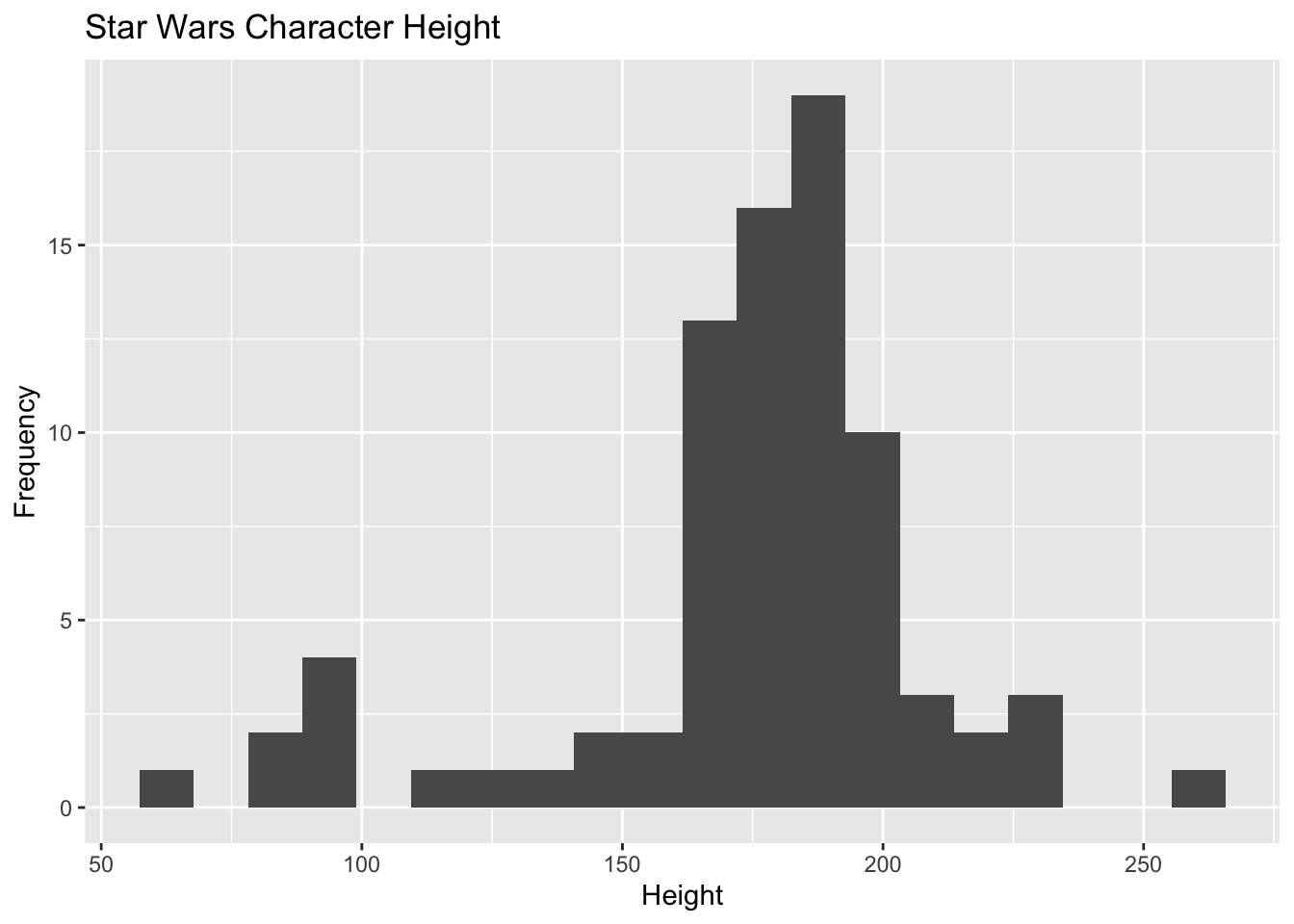
4.4 Inferential Statistics – Hypothesis Testing
The following examples show how to perform the example statistical tests discussed in the section Choosing the Best Statistical Test. Please use that section to understand the purpose and nature of these examples.
4.4.1 Chi-Squared Tests
4.4.1.1 Chi-Squared Goodness of Fit Test
The following code creates the data set used in Example #1 in the Chi-Squared section. When using your own dataset, the result of the table() function can typically be used as the input to the chisq.test() function. For example: chisq.test(table(d$response)).
## These are the frequency counts
counts = c(328, 313, 278, 157)

## We can name the values to make it easier to understand later
names(counts) = c("first year", "second year", "third year", "fourth year")

## Finally, let's inpect the variable's contents
counts
first year second year third year fourth year
328 313 278 157 Once you have the data frequencies counted up, the chi-squared goodness of fit test is easily to perform in R:
chisq.test(counts)
    Chi-squared test for given probabilities

data:  counts
X-squared = 67.071, df = 3, p-value = 1.809e-14
4.4.1.1.1 Example Using “Real” Data
More realistically, you will want to simply calculate a chi-squared test directly on your project data, using the variable names of your dataset. For example, using the mammalian sleep data, we can determine if there are an even number of each dietary type in the dataset. As a reminder, here’s how many animals of each dietary preference we have:
msleep |> select(vore) |> table()vore
carni herbi insecti omni
19 32 5 20 Visually, it looks like there’s a big difference here. After all, 5 insectivores seems like a lot less than 32 herbivores. A chi-squared goodness of fit test checks if that apparent difference is statistically significant. Here’s how to do the test:
msleep |>
    select(vore) |>
    table() |>
    chisq.test()
    Chi-squared test for given probabilities

data:  table(select(msleep, vore))
X-squared = 19.263, df = 3, p-value = 0.0002412
That small p-value indicates that the difference is indeed significant.
4.4.1.2 Chi-Squared Test for Independence
The following code creates the data set used in Example #2 in the Chi-squared section. When using your own dataset, the result of the table() function when tabulating two variables can typically be used as the input to the chisq.test() function. For example: chisq.test(table(d$response1, d$response2)).
## The frequency counts
r1 = c(200, 150, 50)
r2 = c(250, 300, 50)
counts = rbind(r1, r2)

## Add some row and column names to make it easier to understand later
colnames(counts) = c("Infrequently", "Sometimes", "Frequently")
rownames(counts) = c("Facebook: Yes", "Facebook: No")

## Finally, let's inspect the variable's contents
counts
Infrequently Sometimes Frequently
Facebook: Yes 200 150 50
Facebook: No 250 300 50Once you have the data frequencies counted up, the chi-squared goodness of fit test is easily to perform in R:
chisq.test(counts)
    Pearson's Chi-squared test

data:  counts
X-squared = 16.204, df = 2, p-value = 0.000303
4.4.1.2.1 Example Using “Real” Data
Here’s how to conduct this test using the variable names in your actual dataset. In this example, we’ll be using the mpg dataset available in R. Here is the cross-tabulated data showing automobile class and number of engine cylinders:
mpg |>
    select(class, cyl) |>
    table()
cyl
class 4 5 6 8
2seater 0 0 0 5
compact 32 2 13 0
midsize 16 0 23 2
minivan 1 0 10 0
pickup 3 0 10 20
subcompact 21 2 7 5
suv 8 0 16 38The chi-squared test for independence is accomplished using the same method as the chi-squared goodness of fit test:
mpg |>
    select(class, cyl) |>
    table() |>
    chisq.test()
Warning in chisq.test(table(select(mpg, class, cyl))): Chi-squared
approximation may be incorrect
    Pearson's Chi-squared test

data:  table(select(mpg, class, cyl))
X-squared = 138.03, df = 18, p-value < 2.2e-16
4.4.2 Pearson’s Correlation
The following example recreates Example #1 from the Pearson’s correlation section.
## The height data
height = c(64.6, 68.3, 68.8, 69.8, 69.8, 70.3, 70.7, 70.8, 72.3, 74.0)

## The weight data
weight = c(182, 187, 192, 196, 201, 204, 210, 212, 215, 220)

## Let's make a scatterplot to see the relationship between the data
plot(height, weight)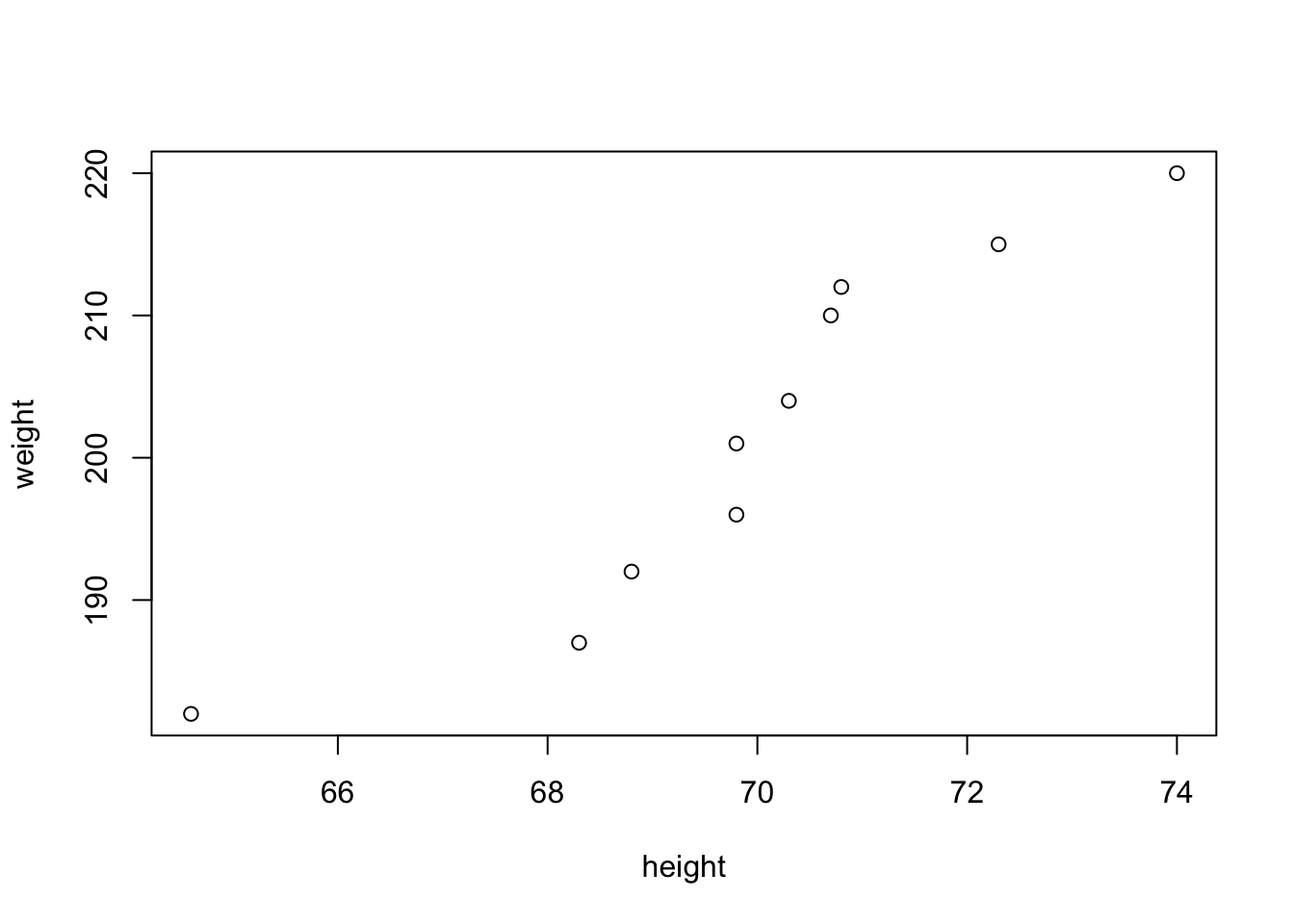
Calculating a correlation is simple in R, assuming you have two numeric variables:
## Pearson's correlation
cor(height, weight)
[1] 0.9311184However, it is typical to perform a t-test to determine whether the correlation is statistically significant. This is trivial in R: just change the name of the function:
## Pearson's correlation
cor.test(height, weight)
    Pearson's product-moment correlation

data:  height and weight
t = 7.2209, df = 8, p-value = 9.058e-05
alternative hypothesis: true correlation is not equal to 0
95 percent confidence interval:
 0.7286935 0.9839169
sample estimates:
      cor
0.9311184
4.4.2.1 Example Using “Real” Data
If you’re starting from an existing dataset contained in a tibble, you can calculate a correlation directly by selecting which columns/variables to correlate. For example, using the mpg data, we can check for a (likely) correlation between city mpg and highway mpg:
cor.test(mpg$cty, mpg$hwy)
    Pearson's product-moment correlation

data:  mpg$cty and mpg$hwy
t = 49.585, df = 232, p-value < 2.2e-16
alternative hypothesis: true correlation is not equal to 0
95 percent confidence interval:
 0.9433129 0.9657663
sample estimates:
      cor
0.9559159
4.4.3 Spearman Rank Correlation
While Pearson’s correlation is used for ratio data, sometimes we find the need to calculate correlations between ranked data (e.g., such as Likert numbered response data). For this, Spearman’s rho should be calculated. Thankfully, in R this is as simple as changing a minor option.
Say that we have two sets of Likert response data. Each participant answered both questions, each of which is numbered on a scale from 1 to 7. We want to see if there is any correlation between their responses on these two questions. Here’s how to accomplish this in R:
## First, let's create some fake data
likert_1 = c(4, 2, 5, 2, 7, 1, 3, 3, 5, 6, 2, 7, 7)
likert_2 = c(5, 1, 7, 3, 7, 2, 2, 5, 6, 6, 4, 6, 7)

## Let's visualize the data
plot(likert_1, likert_2)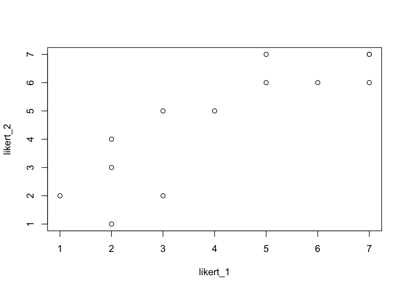
It looks like there’s a strong correlation present in the data. Let’s verify using Spearman’s Rank correlation:
cor.test(likert_1, likert_2, method = "spearman")
    Spearman's rank correlation rho

data:  likert_1 and likert_2
S = 45.243, p-value = 8.734e-05
alternative hypothesis: true rho is not equal to 0
sample estimates:
      rho
0.8757062
4.4.3.1 Example Using “Real” Data
If you’re starting from an existing dataset contained in a tibble, you can calculate a correlation directly by selecting which columns/variables to correlate. For example, using the mpg data, we can check for a correlation between the number of cylinders and the displacement of engines.
For starters, let’s take a look at the relationship between these two variables:
mpg |>
    ggplot(aes(cyl, displ)) +
    geom_point()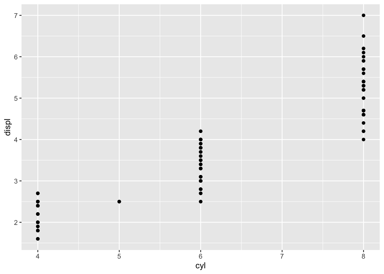
Notice how the points pile up in vertical columns? This is because the number of cylinders is not continuous (it’s closer to nominal data), as you can’t have an engine with, say, \(4 \frac{1}{2}\) cylinders. A Pearson’s Correlation would be inappropriate here. Instead, we can use a Spearman’s Rank Correlation:
cor.test(mpg$cyl, mpg$displ, method = "spearman")Warning in cor.test.default(mpg$cyl, mpg$displ, method = "spearman"): Cannot
compute exact p-value with ties
    Spearman's rank correlation rho

data:  mpg$cyl and mpg$displ
S = 126243, p-value < 2.2e-16
alternative hypothesis: true rho is not equal to 0
sample estimates:
      rho
0.9408821
4.4.4 t-test
4.4.4.1 One Sample t-test
The following example recreates Example #1 from the t-test section.
## The data: alcoholic drinks per week
drinks = c(1, 0, 2, 2, 0, 4, 2, 0, 0, 3, 1, 0, 3, 2, 0, 1, 1, 0, 2, 0)

## Let's confirm the mean number of drinks
mean(drinks)
[1] 1.2The one sample t.test is calculated by doing the following:
t.test(drinks)
    One Sample t-test

data:  drinks
t = 4.3289, df = 19, p-value = 0.0003617
alternative hypothesis: true mean is not equal to 0
95 percent confidence interval:
 0.6198052 1.7801948
sample estimates:
mean of x
      1.2
4.4.4.1.1 Example using “real” data
Conducting a one sample t-test on an existing dataset contained within a tibble is also possible. For example, let’s say we wanted to check if the mean mass of characters in the Star Wars universe was > 0 (that’s the default one sample test). We can test this as follows:
starwars |> select(mass) |> t.test()
    One Sample t-test

data:  select(starwars, mass)
t = 4.4109, df = 58, p-value = 4.525e-05
alternative hypothesis: true mean is not equal to 0
95 percent confidence interval:
  53.15109 141.47264
sample estimates:
mean of x
 97.31186
It appears the mean is different from 0. However, this is silly, as we would expect the mean to be greater than 0 for living creatures. Let’s test a better hypothesis by selecting a mean different from 0. Let’s check what Luke Skywalker’s mass is:
starwars |> filter(name == "Luke Skywalker") |> select(mass)# A tibble: 1 × 1
mass
<dbl>
1 77Luke has a mass = 77. Let’s test whether the mean mass of all Star Ways characters is different from Luke’s mass:
starwars |> select(mass) |> t.test(mu = 77)
    One Sample t-test

data:  select(starwars, mass)
t = 0.9207, df = 58, p-value = 0.361
alternative hypothesis: true mean is not equal to 77
95 percent confidence interval:
  53.15109 141.47264
sample estimates:
mean of x
 97.31186
Although the reported mean mass = 97.312, this is not statistically different from 77.
4.4.4.2 Two Sample t-test
The following example recreates Example #2 from the t-test section.
## The data
young_adult = c(38, 44, 50, 36, 30, 38, 63, 52, 56, 35, 46, 49, 43, 25, 32, 24, 63, 53, 31, 50)
middle_aged = c(34, 47, 64, 51, 59, 50, 40, 39, 54, 44, 38, 41, 48, 28, 51, 37, 35, 70, 35, 41)
The two sample t.test is calculated by doing the following:
t.test(young_adult, middle_aged)
    Welch Two Sample t-test

data:  young_adult and middle_aged
t = -0.67782, df = 37.75, p-value = 0.502
alternative hypothesis: true difference in means is not equal to 0
95 percent confidence interval:
 -9.569413  4.769413
sample estimates:
mean of x mean of y
     42.9      45.3
4.4.4.2.1 Example using “real” data
Continuing our use of the Star Wars dataset…
Let’s see if there is a different in the mean height of male versus female characters. First, let’s take a look at just the data we’re interested in:
starwars |>
    filter(sex %in% c("female", "male")) |>
    drop_na(sex, height) |>
    group_by(sex) |>
    summarize(height = mean(height))
# A tibble: 2 × 2
sex height
<chr> <dbl>
1 female 172.
2 male 179.Mean heights for female and male characters are pretty similar, with a slightly greater height for male characters. But is this difference statistically significant?
Here’s the data we need for the t-test
height = starwars |>
  filter(sex %in% c("female", "male")) |>
  select(height, sex) |>
  drop_na()

height
# A tibble: 71 × 2
height sex
<int> <chr>
1 172 male
2 202 male
3 150 female
4 178 male
5 165 female
6 183 male
7 182 male
8 188 male
9 180 male
10 228 male
# ℹ 61 more rowsThe t-test:
t.test(height ~ sex, data = height)
    Welch Two Sample t-test

data:  height by sex
t = -1.1817, df = 48.471, p-value = 0.2431
alternative hypothesis: true difference in means between group female and group male is not equal to 0
95 percent confidence interval:
 -20.396341   5.293584
sample estimates:
mean in group female   mean in group male
            171.5714             179.1228
There is indeed no statistical difference between the heights of female and male characters.
4.4.4.3 Repeated Measures t-test
The following example recreates Example #3 from the t-test section.
## The data
non_finals_anxiety = c(38, 44, 33, 35, 26, 23, 27, 32, 40, 38, 21, 22, 21, 16, 26, 25, 16, 23, 28, 7)
finals_anxiety = c(22, 18, 34, 32, 47, 40, 53, 52, 47, 21, 25, 48, 48, 40, 15, 43, 48, 37, 19, 34)
The repeated measures t.test is calculated by doing the following:
t.test(non_finals_anxiety, finals_anxiety, paired = TRUE)
    Paired t-test

data:  non_finals_anxiety and finals_anxiety
t = -2.3091, df = 19, p-value = 0.03234
alternative hypothesis: true mean difference is not equal to 0
95 percent confidence interval:
 -17.348494  -0.851506
sample estimates:
mean difference
           -9.1